Technology is always changing, and new features, tools, and toys show up all of the time. However, many times we forget about some of the basics that really produce better results. I find it hard to believe that in 2015 many non-profit websites are lacking the 5 things presented here, but many do. For that reason, we present the 5 website Must-Haves in 2015!
1. Responsive Design
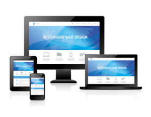
 Your website must be responsive in 2015. Responsive design means your website is built display across many platforms and browsers. It is built to “respond” to what the user is using to view your website. A responsive site will move elements to fit within the width and height of the device or browser, so you may see a horizontal row on a desktop screen, but those horizontal boxes move to a vertical layout on a phone.
Search Engine Changes
Google made a change in April of this year, which supports responsive websites. Google feels users want to see mobile-friendly websites when searching on their mobile devices. They changed their mobile search algorithms to rank mobile-friendly sites much higher than standard websites. If your organization doesn’t have a mobile friendly or responsive website, you could be alienating mobile visitors and not showing up in mobile searches!
2. More Content
We know content is king and has been for a long time. Various experts and commentators have called other online marketing elements the new “king,” but it really is still just content. The difference is now quality and quantity of content.
In 2015, web users are inundated with content from all sources not just other non-profits. Everyone is sharing an image, video, or infographic. Many companies in many industries have bought into the idea od a content marketing strategy, which means social feeds, search engines results pages, YouTube, and other online aggregates are flooded with content. This makes it harder and harder to get the attention of donors, volunteers, and constituents.
Think Like A Publisher
When developing a content strategy, think like a publisher or media company. They understand compelling headlines, timely news, and, ultimately, quality content. They understand their users will leave their site and go someone else if their content doesn’t attract and engage.
You must think about editorial calendars, posting schedules, etc. in order to be relevant and deliver content that engages. No longer can you put out random posts of unrelated content and expect your followers to engage with you. You should prepare a regular content schedule and post information that relates to your organization goals. When you start, be sure to be realistic with what you can actually do. You should plan once a week at a minimum, but consider gradually increasing your frequency over time.
Videos, Infographics, and Media

In an era where everyone is creating content and social feeds are crowded with stale posts, you can stand out with better content, namely better media. Utilize videos, infographics, and other forms of media that extends past text (don’t bring up the fact that you are reading a text-based blog right now) to engage your followers. Videos and infographics allow people to consume content quicker. Presentations allow users to click through content much quicker. You get the idea. Consider content that helps your followers learn more, see more, and understand more via graphics.
Stories
So many non-profit organizations say they have no content. They don’t know what they can share, what they could use on video, or information that would be good for an infographic. However, there are so many stories in your organization. What is your mission? Who do you help? Many times, people working in non-profits get so wrapped up in the day-to-day of the organization that they forget the stories that are all around them. These same stories are what donors want to know about and see. This is what drives people to support an organization, so think about sharing as many stories as you can!
3. Large Donate Button

I think this one is obvious, but I have seen quite a few non-profit sites lately that didn’t have a large, easy-to-find way to donate and support their organization. This should be one of the first considerations for your website. Make it easy for donors to support your organization.
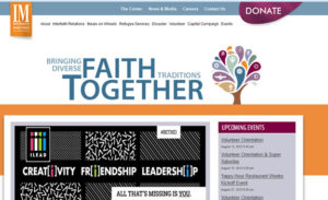
To make it easy, help visitors find the Donate page. Use a large button, different colors, or unique placement to bring attention to your Donate link. Next, make it easy for them to donate. I have seen pages that asked too many questions, didn’t offer convenient payment processing, or required the visitor to send cash or check in. In 2015, there are too many options for non-profits to accept donations. Even Facebook is implementing a Donate button on non-profit pages. Find some options that make it easy to process to go along with your large, bold Donate button!
4. Ways to Connect
I think this is widely-known, but sometimes I find this lacking like the easy-to-find donate button. Make it easy for visitors to connect with you. If they have made it to your home page, they are interested in your organization. No, not everyone is going to follow you on Facebook, but make it easy for them to find it.
The best case studies of success in social media are for non-profits, so you probably already have a Facebook page, Twitter account, and more. Help your website visitors find your social channels, so they can follow you. Utilize social feeds, share buttons, like buttons, retweet options, and any other form of social connection that makes sense to your website. Don’t overdo it with social buttons. Just focus on your best channels and make it easy for people to connect.
The Email Signup
You should also make it easy for people to sign up for your newsletter and other emails. I don’t really mean that you need the standard “Sign Up For Our Newsletter” box on the home page. All that says to a user is, “Want more junk in your inbox? Sign up here!”
Be creative when you ask someone to sign up. Put a box at the end of a case study. Add it in the middle of a success story. Ask for the email address when you feel like you have engaged the user enough to want to sign up. You should keep a signup form in a utility menu, on the home page, or where ever it makes sense on your website, but don’t expect a lot from the standard places. Give them a reason to want your email.
This goes for social media as well. You should explain in specific terms what a user can expect when they connect with you on a channel. Tell them what kind of posts you share on Facebook. Explain the pictures you pin on Pinterest. Give them examples of stories and information you send out via email. People don’t want more junk, but if they have engaged with your organization, they are more inclined to receive your email. However, you usually need to push them a little more. Explaining what they will get from a channel or your email will help them agree to receive your communications.
5. Spread the News!
I am a member of several non-profit Boards of Directors, and I am constantly frustrated with the lack of news and information that is shared about what the organization is doing. I know it seems trivial to some in the organization, but we want to know where our money is going. What are you doing with your donations? How are you pursuing your mission?
It’s not a waste of time to communicate event the small stories. Sometimes those are the biggest in a donor’s heart. No one will know about it, if you don’t share it. You are a non-profit organization serving a cause. People engaging with you expect to hear the news. You have to use common sense with the frequency and channels used, but spread the news often. Explain how you are helping and serving your cause. This helps donors understand why they donated and how they are supporting your pursuit of your mission!
There are many forms of technology and cool new gadgets to add to your website and incorporate in many areas of your organization. Be sure to consider some of the basics like we discussed here to ensure you have a proper foundation before considering adding new toys.
 Posted by AMA Member: Nate Stockard, owner of Blue Atlas Marketing, a web marketing and website development company, and the Director of Website Marketing for AMA Houston.